“Why is Castro Valley Boulevard so tan?” Many people have spoken up complaining about the overall drabness in our Downtown business district. How did this come to be? Why is colorfulness discouraged, and remodeled buildings are awash in “50 Shades of Beige?” Lets take a look at the history.
Castro Valley lives under a General Plan. This plan is developed by the County and local advisory committees made up of concerned local citizens. The first plan was published in 1960. It was revised in 1974, and 1978. The 1978 plan called for an additional Specific Plan to deal solely with the Castro Valley Boulevard “Central Business District.” This “Specific Plan” was then published in 1983 and revised in 1993.
Our Municipal Advisory Council (MAC) is tasked with reviewing most new business developments, and cosmetic facelifts in Castro Valley. They evaluate the plans against our General Plan and Downtown Specific Plans for compliance with our towns overall goals. They then advise the County Planning Department whether or not to approve the new designs. Usually, the County agrees with the MAC recommendations. Not all repaints come before the MAC. Since they only review Site Development issues, if a business is simply repainting their building, a SDR is not usually required. If a repainting job is out of compliance with the specific plan, the County could make them repaint in different tones.
The MAC relies heavily on the wording in the specific plan to approve, or request modifications to submitted designs. So, what exactly does the plan say about color? The 1960, 1974 and 1978 plans do not mention color schemes at all. The first time it comes up is in the 1983 Central Business District Specific Plan. Here is the exact wording:
Castro Valley Central Business District Specific Plan – April 1983
Colors:
Use of “earthtone” colors should be encouraged, (for example, off whites, browns, ochres, and rusts)
Muted colors are encouraged for large areas such as building walls
Wood elements should be left natural, or stained (green, brown, tan, rust, etc.)
Color treatment of a building’s entire facade and all visible sides should be compatible
The color palette chosen for a building should be compatible with the colors of adjacent buildings. An exception is when the colors of adjacent buildings strongly diverge from the design guidelines of this plan
In buildings of a particular historical character or architectural lineage, exterior colors should be similar to buildings of its type.
Wherever possible, minimize the number of colors appearing on the building exterior. Small commercial buildings should use no more than three colors.
Architectural detailing should be painted to complement the facade and tie in with adjacent buildings.
Accent colors for trim should be used sparingly and be limited in number for each building. Accent colors on adjacent buildings should be chosen to compliment one another.
Building walls should not be used as painted signs and especially as painted advertisements.
As you can see, the plan specifically lists “earthtones” as the preferred color scheme. Browns, tans and “rusts” were very popular colors in the late 1970’s and early 1980’s (remember the original BART interiors?) so this was in line with contemporary tastes. Paint schemes were to be limited to three or fewer of these colors on “small” buildings, and accent colors should be used “sparingly.”
When the plan was revised in 1993, the section referring to color was rewritten:
Castro Valley Central Business District Specific Plan – January 1993
Historically, building color in Castro Valley Central Business District has not been limited to any one range. Some buildings with wood siding have been stained rather than painted and are darker in tone, but the predominant pattern is that buildings are painted in light tones. Where Site Development Review is required, building colors shall be reviewed for consistency with these guidelines:
Decorative or accent facades materials such as those used on storefronts, shall be complementary to primary materials used on exterior surfaces of the building. The application of false stone work, lava rock, plastic, aluminum, or wood panelling to cover over storefronts or building facades is prohibited.
Contiguous storefronts in a building shall use the same building materials, style and scale of architectural ornamentation.
Similar or compatible building materials shall be used on all floor levels and all elevations of a given building.
Predominant building colors should generally be light in tone, but are not necessarily restricted to any one color range, such as earth tones. Corporate colors not consistent with this or other guidelines on color shall not be used. Darker colors may be used for trim.
Muted colors are encouraged for large areas such as building walls.
Wood siding or trim may be left natural and stained to be light in tone.
The color scheme for a building’s entire facade and all visible sides shall be consistent.
The color scheme for a particular building shall be compatible with the colors of adjacent buildings, unless the colors of adjacent buildings strongly diverge from these Design Guidelines. In such a case, the Guidelines shall prevail.
Wherever possible, the number of colors appearing on the building exterior should be limited to no more than three colors or tones of the same color, including trim and accent colors.
This new color section starts out with the statement “Historically, building color in Castro Valley Central Business District has not been limited to any one range.” Looking back, it clearly and specifically was limited to one range, earth tones, for the previous ten years. Furthermore, the new plan goes out of its way to distance itself from the 1983 plan by saying “colors should generally be light in tone, but are not necessarily restricted to any one color range, such as earth tones.” In a short ten year span, the planners have moved from an earth tone-centric view to one which embraces the whole rainbow, albeit the “light tones” of the rainbow. Why this change of heart and policy occurred, was never committed to print.
The Downtown Specific Plan was meant to guide development policies for a 20 year period, through 2012. This plan has not been yet updated, although plans to update it are on the horizon. Chances are, a new one will not be in force for a number of years. The last time that the overall Castro Valley General Plan was updated in 2010, the process took seven years to complete.
Since this specific plan is the only road map that the MAC has to draw from to advise on project color schemes, how have they done on paint issues they’ve seen for the last 21 years? Let’s take a look at some recent projects and the “color commentary” from the MAC.
TJ Maxx – 2013
TJ Maxx store in Castro Village
On March 11th, 2013, the MAC reviewed the proposed design of the new TJ Maxx building in Castro Village. The Applicant, Randy Nahas said the building exterior will consist of six colors. Vice Chair Miraglia noted that she “may consider four colors for the building exterior, however the architect should be able to revise the color scheme to comply with the Downtown Specific Plan…”and its specified three shades. The conversation continued with the TJ Maxx representative explaining that “with a large building you breakdown size by the use of color. Limiting the color pallet to 3 colors will not achieve this.”He also pointed out the overall shopping center contains more than 3 colors. To differentiate between businesses, the use of more than 3 colors is needed. MAC Chair Crawford acknowledged the Specific Plan mentions 3 colors. The Vice Chair responded if Council did not want to be limited to 3 colors the Specific Plan should be changed. County Staff then explained the 3 color pallet in the Specific Plan is a recommendation. The Council can make distinction by project. Crawford also added that “He was willing to make the distinction this one time. Limiting the building to 3 colors could make it look worse.” Finally, a motion was approved to recommend that the exterior building color pallet not be limited to three colors and may actually be up to the five suggested by the architect. Eventually, the building was built using 5 shades of light earth tones.
Jack In The Box Remodel – 2013
Jack in the Box on Castro Valley Blvd.
On June 24, 2013, the MAC heard a proposal for a remodel to the existing Castro Valley Jack in the Box restaurant remodeling the exterior using more modern colors (similar to a Jack in the Box pictured here.) The dominant color was to be a shade of brick red called “fireweed.” County staff was recommending approval of the project. Vice Chair Miraglia did not believe the proposed paint colors were in compliance with the Castro Valley Specific Plan. She was surprised that County Staff did not observe that dark colors are only to be used for accent purposes. Overall, the Council believed the color was too strong for such a large coverage area.
The restaurant representatives returned on July 22nd with a revised color scheme limiting it to two colors, “Downing Straw” and “Balanced Beige,” with the Red color reduced to an accent role, primarily on an architectural tower feature on the front of the building in an area measuring approximately nine feet by 30 inches. The Vice Chair was adamant the area to be covered by the dark red was still too large to be considered trim and therefore it was not in compliance with the Specific Plan. She also said approximately 50% of the red area should be reduced. Chair Crawford agreed, saying “Half of the building encompassed in Fireweed is not considered trim.” Eventually, after more plan modifications the remodel was approved and the building was completed with significantly less red in the palette.
Dell Cafe – 2009
Dell Cafe on Castro Valley Blvd
At the August 24, 2009 MAC meeting, a plan for renovating the neon sign at Dell Cafe was presented. The plan also included a new awning, and a repaint of the building. Among other changes, the new paint scheme included blue around the window areas. Council Member Miraglia said that while she was really excited about the café being renovated, however she thinks that the design is not in keeping with what Castro Valley residents envision. “The colors are too loud and bright for the boulevard.” Council Member Nielsen said that one of the things that the Council had tried to do in the past was to “stay away from bright colors.” Council Members Moore and Cunha said that they had no problem with the colors. The MAC requested design changes to bring the color pallette more in line with the Specific Plan.
A new design was presented at the February 8, 2010 MAC meeting. Council Member Miraglia commented that the new colors are “much more in keeping with Castro Valley”. She wanted to acknowledge the Castro Valley Chamber of Commerce’s concern about the blue. It was also revealed that there had been positive feedback from Chamber members in support of the proposed color scheme. The plan was approved.
Shari’s/Walgreens in Castro Village – Remodel – 2010
Sharis Restaurant in Castro VillageWalgreens in Castro Village
On May 24, 2010, “color board” for the proposed remodel project was presented to the MAC and the Council approved the color scheme, without comment. The plan was approved and the buildings were remodeled. The final colors were pale yellow and green predominantly on the Walgreens, and yellow and peach on Shari’s.
Pete’s Hardware – Wall Mural – 2010
The Mural at Pete’s Hardware
A proposal for improvements at the Pete’s Hardware store on Castro Valley Blvd was presented to the MAC on September 13, 2010. The proposal included new murals on the sides of the building. The property owner described the colors (beiges, tans and cream) to be used in the mural. Council members Sadoff, Neilsen, and Crawford supported the proposal. Council member Miraglia however stated that she does not like the mural. The plan was approved.
Muzo’s – 2013
The Mural at Muzo’s – Courtesy of CVLegends
A completely different mural was discussed at the May 13, 2013 MAC meeting. A local resident was trying to open a hot dog stand at the former “Cary Outee” restauarant on Castro Valley Blvd. Among many other problems the owner was having with the County, one was his choice of color for the building, and the addition of a very colorful mural on one wall of the building. Overall the structure was to be predominantly dark brick red.
Vice Chair Miraglia said that “the County has a Specific Plan. The Plan was written by residents of Castro Valley in conjunction with the County. Although there are things the Council would like to change. All of these things take a considerable amount of money. It takes 2 to 3 years. The General Plan took 7 seven years to complete. Specific Plan language states light colors should be used for trim compatible with neighboring buildings. Colors need to be changed to comply with the Specific Plan.”
Chair Crawford continued “the Council rarely goes against the Specific Plan. They may want to make changes however this is the document they have.”
A proposal to remodel the Burger King on Castro Valley Boulvard was presented to the MAC in early 2014. The design was to have been similar to other newly remodeled Burger Kings (click to see an image.) MAC had previously requested changes, so in April the franchisee presented a revised plan. The black tower element was softened with an additional dark brown tone. The majority of the exterior walls were changed to beige. The lower brick was changed to a red tone. Although the colors were not necessarily in line with the Specific Plan, their proposal is to use darker earth tones which they said was is in the same tonal family. County Staff recommended approval.
Chair Crawford explained that the proposed revised project featuring black on the building tower “…does not comply with the Specific Plan.” Vice Chair Miraglia agreed with the Chair. “The proposed colors are too dark. Colors should be lighter but still provide some contrast.” Chair Crawford reiterated that the Specific Plan allows dark colors only on trim. The Vice Chair added that the parapet color, although a corporate color, was still not acceptable.
Chair Crawford said that “The Castro Valley Specific Plan is 21 years old however the Council is going to stick to it.” He recommended the Applicant make changes then return to the Council. Mr. Nassar’s partner said they were willing to lighten the tower color. The Chair agreed, but added that “the goal is not to make the building look uninteresting.”
At the June 9th MAC meeting, a revised paint scheme was presented. Originally, the building was to be predominantly tan, with black for the raised tower area. The owner replaced the black with the same tan color to comply with the Downtown plan. This plan was approved, but construction has not yet begun.
Quality Inn (now the Comfort Inn) – 2004
Quality Inn April 2011Quality Inn January 2014Comfort Inn September 2014
The Quality Inn on Castro Valley Blvd (later known as the Holiday Inn Express, and currently as the Comfort Inn,) has seen many color changes over the years. In August of 2004, a plan was presented to the MAC to remodel parts of the building, and the plan included a repaint, including a blue color. Council member Carbone commented on the blue, and asked if there was a plan to change the color scheme. The property owner replied yes, the blue color would be completely removed. The revised plan was approved, and the color scheme implemented (as seen in the above picture from 2011.) The building was later repainted in an even paler scheme of gray and white (as seen in the above picture from January 2014) which was never heard by the MAC.
As part of a rebranding to “Comfort Inn” later in 2014, the building was again repainted (as seen above in a current picture.) The new scheme, although contemporary, is a distinct departure which features swaths of a dark grayish-blue color complemented by a fairly dark shade of peach. This scheme never came before the MAC either, so we don’t know how they would have reacted.
Perhaps the paint will change, since that has happened before. Some years ago, the Rite Aid building on East Castro Valley Blvd underwent a new paint job. Included in the new color scheme was a fairly bright shade of yellow painted on the roof “mansard.” After this was completed, the MAC proactively reached out to Rite Aid management and had them repaint the roof in a more muted shade of pale yellow to comply with the SDP.
In conclusion, it is clear that the MAC abides by the strict constructs of the Specific Downtown Plan wording. It is also clear that they desperately want the County to update the plan to reflect the modern wishes of the town. The “tan” legend is really one of the past, and a holdover to those ten years when they specifically urged “earth tones” between 1983 and 1993.
Since then, the palette encouraged by the MAC is fairly broad (although still pale) and includes many examples of yellows, greens and peach tones. The MAC has also been very good about working with developers to help them abide by the outdated plan, while still looking modern and fresh (the Jack in the Box being a good example since it arguably looks better than the original proposal.)
This entire article should serve as a good reminder that we sorely need an update to our ancient Specific Plan. It will take years to revise, so it should be started now. At 21, the Specific Plan is already old enough to drink, and at the County’s current pace it could be nearing 30 by the time a new one is in place. That is much too long for us to expect the MAC to wrestle with out-of-date aesthetics standards in our “revitalized” Downtown core.
Related
Thank you, Michael, for a truly informative presentation explaining the homogeneity of our “downtown” building facades. Perhaps the #1 goal of the MAC should be to update the Downtown Specific Plan. That process would include a number of public hearings where all Castro Valley residents would be encouraged to share their opinions of how they want their town to look.
If there is insufficient funding at the County level to staff an update of the overdue Specific Plan, then perhaps the County should increase their planning fees to generate sufficient revenue. Those revenues could only be used for planning purposes. A reasonable amount of funding from fees can be generated for this purpose, even under 1996’s Proposition 218. I used to make those fees for cities and counties throughout California.
Thanks for your “color commentary!” I’ve been pleased with the transformation of the Boulevard in my 15 years of CV residency. It used to stand in stark and awkward contrast to the gorgeous natural beauty that surrounded it. Now it harmonizes. I love the streetscape improvements and landscaping, but I’ve wondered why we beige pervades. I like the mural on Pete’s Hardware (though again, beige!) and I loved the cool mural that was painted over. I hope CV isn’t forever timid because of the canoe-mageddon (which I never saw but from the photos I always wondered about the violent backlash). Being out on the Blvd yesterday at the Fall Festival made me long for a town square or village green. I would love to participate in any planning process that gives us a crack at making our downtown a more lively and welcoming place.
People have been using the space in front of Chase bank as an impromptu town square during the Fall Festival! Hanging out, chatting, eating, you name it.
I believe alot of the tan rules are in response to the purple optometrist building that caused uproar of canoe sign proportions. Cant remember what year that was but likely matches one of those color scheme updates.
Circa 1990 that was my Optometrist. A very nice lady, I thought the purple was a good color for that building it meant something to her as well, In her country it was meant to Bring Good Luck, way to kill enthusiasm for Castro Valley Uniqueness and Originality. Lets just paint everything grey like a Gulag.
Meanwhile in Lyon France they have slowly been coloring the old buildings in Pastel colors HOW ATROCIOUS!!!
Good job Michael. Brings back memories when I was just getting involved in the community. I was surprised that I was selected to serve on the Castro Valley General Plan rewrite in 1985 by then Supervisor Joe Bort. I think I still have a list of folks who served on it with me.
The last that I heard is that Castro Valley is next in the cue for an updated specific plan. Currently citizen groups are updating Ashland and Cherryland Business Districts and Fairview Area Specific Plans.
Bob
I like all the pictures showing the tan/brown/rust color scheme. It shows that Castro Valley has a very tanish color scheme. ( Not including the Muzo’s Mural)
The Alameda County Board of Supervisors Unincorporated Services Committee meets on Wednesday, April 27 at 6:00 pm to hear from the Local Agency Formation Commission (LAFCo) about a proposed fiscal analysis of the feasibility of incorporating Castro Valley and the other Alameda County unincorporated communities.
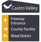
Have you ever wondered where the freeway was? Or where is the retail district? Alameda County is developing the Eden Area Signage Plan to outline wayfinding and gateway signage for areas of urban unincorporated Alameda County, including: Ashland, Castro Valley, Cherryland, Fairview and San Lorenzo. The Economic and Civic Development …